← All work
↗Let'S TalkSkincare brand
E-commerceBeautySkin care
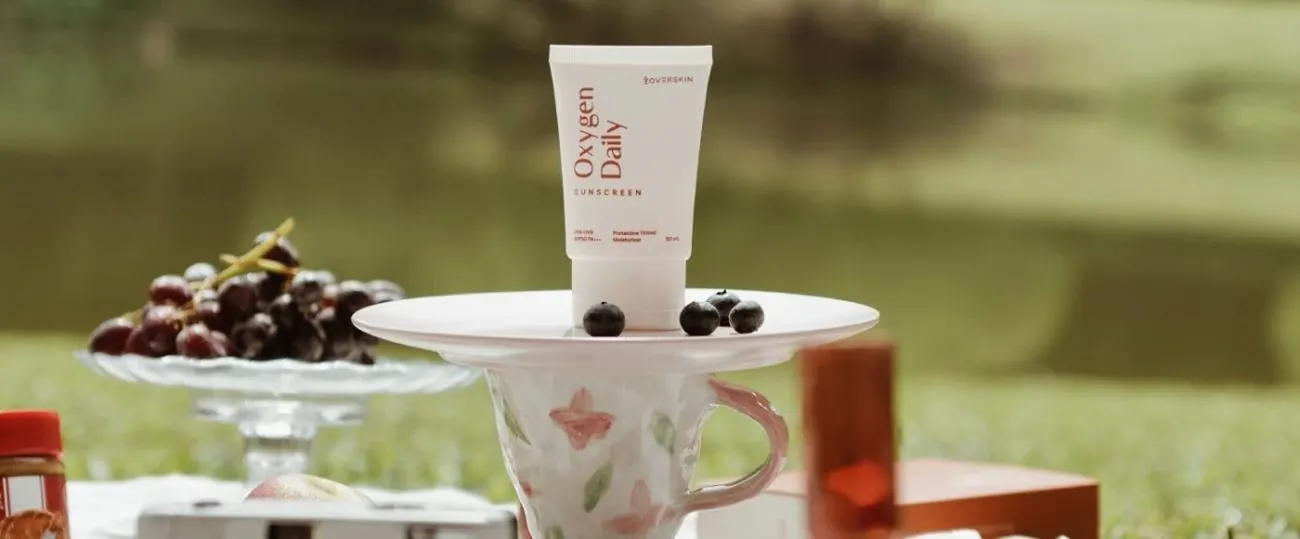
A warm, sunlit skincare shop that lets the products and textures take the spotlight.
- Industry
- Beauty & Personal Care
- Category
- Website Development
- Client

- Type
- Skincare e-commerce
Calm pages for premium skincare.
The brand needed an online shop that felt as calm and premium as its skincare.
Soft peach and orange tones, close-up product photography and clean product pages make browsing feel like a slow morning routine, not a checkout.
- UX/UI design
- Front-end development
- Copywriting
- WordPress development
- Custom features
- Soft peach and orange palette taken from the packaging
- Close-up product shots with creamy textures
- A bright orange band for the hero message so it stands out from the calm page
- Model photos next to products, so shoppers see the routine, not just the bottle
Calm, not loud
Warm neutral tones keep the shop feeling premium instead of discount-driven.
Texture sells
Close-ups of the creams do the persuading that long descriptions can't.
One accent colour
Orange is used only where we want attention: headlines and buttons.
THE DESIGN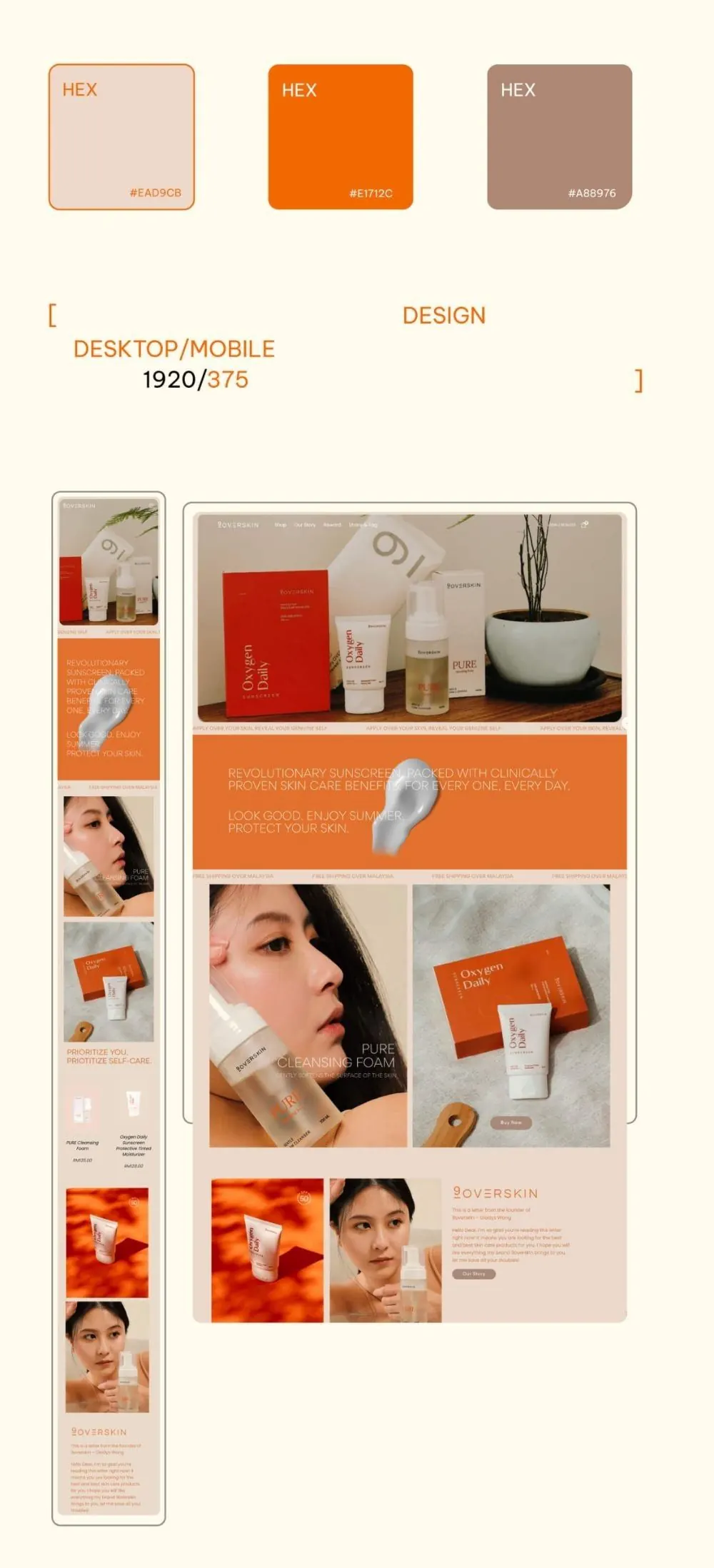
Desktop & mobile.

NEXT PROJECTGym
LET'S TALK
Want one like this?
Tell us what you're building. We reply within one working day with a first idea, not a sales script.